About the Project
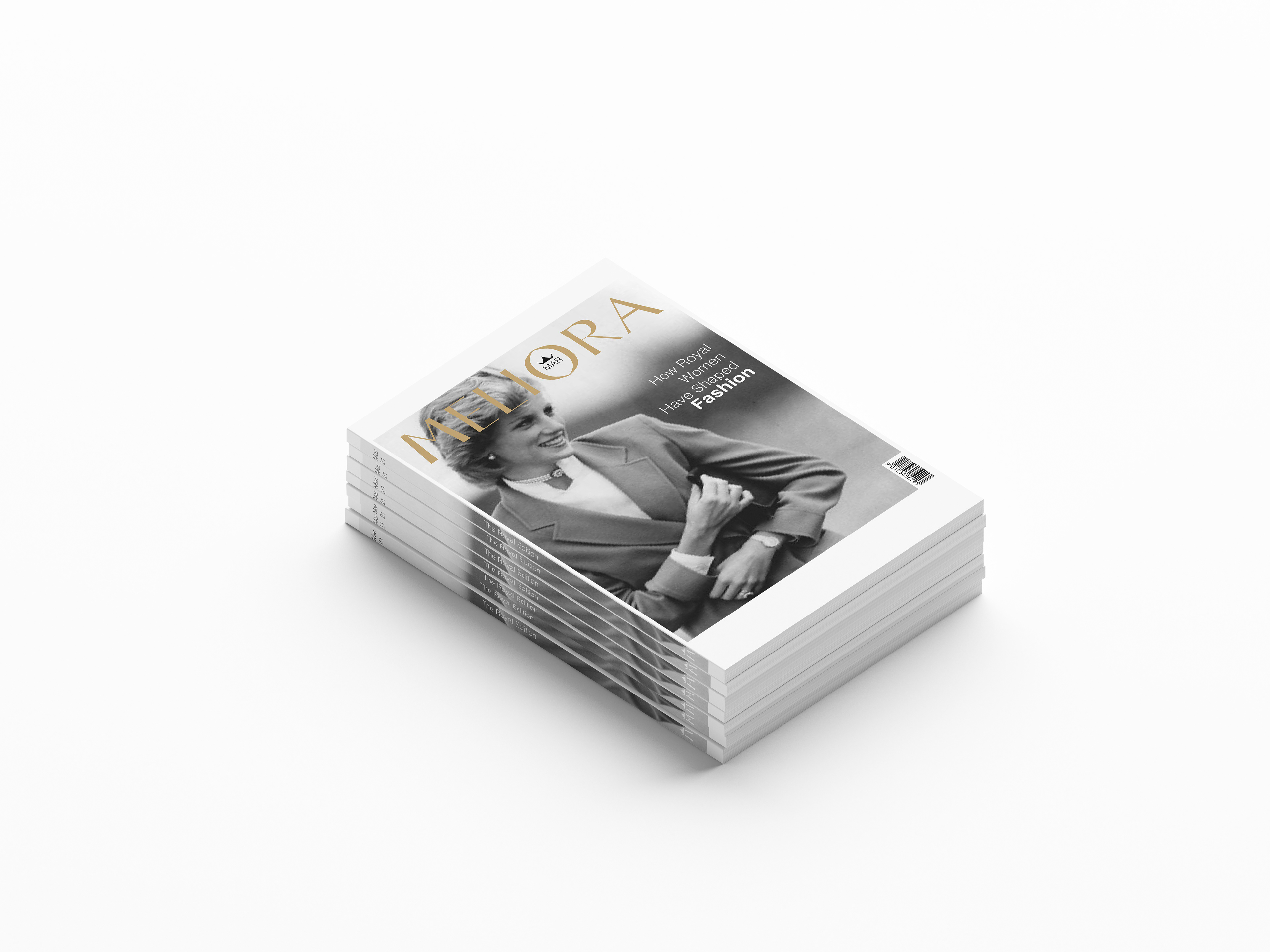
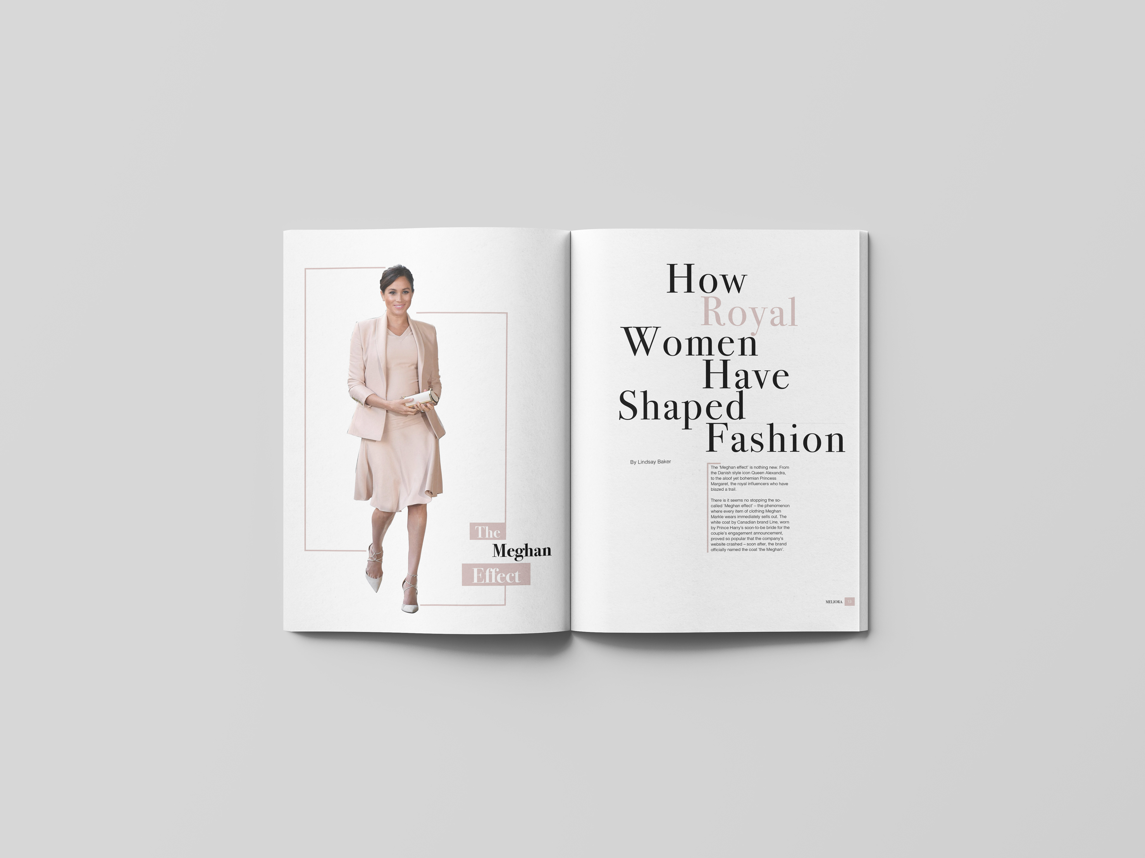
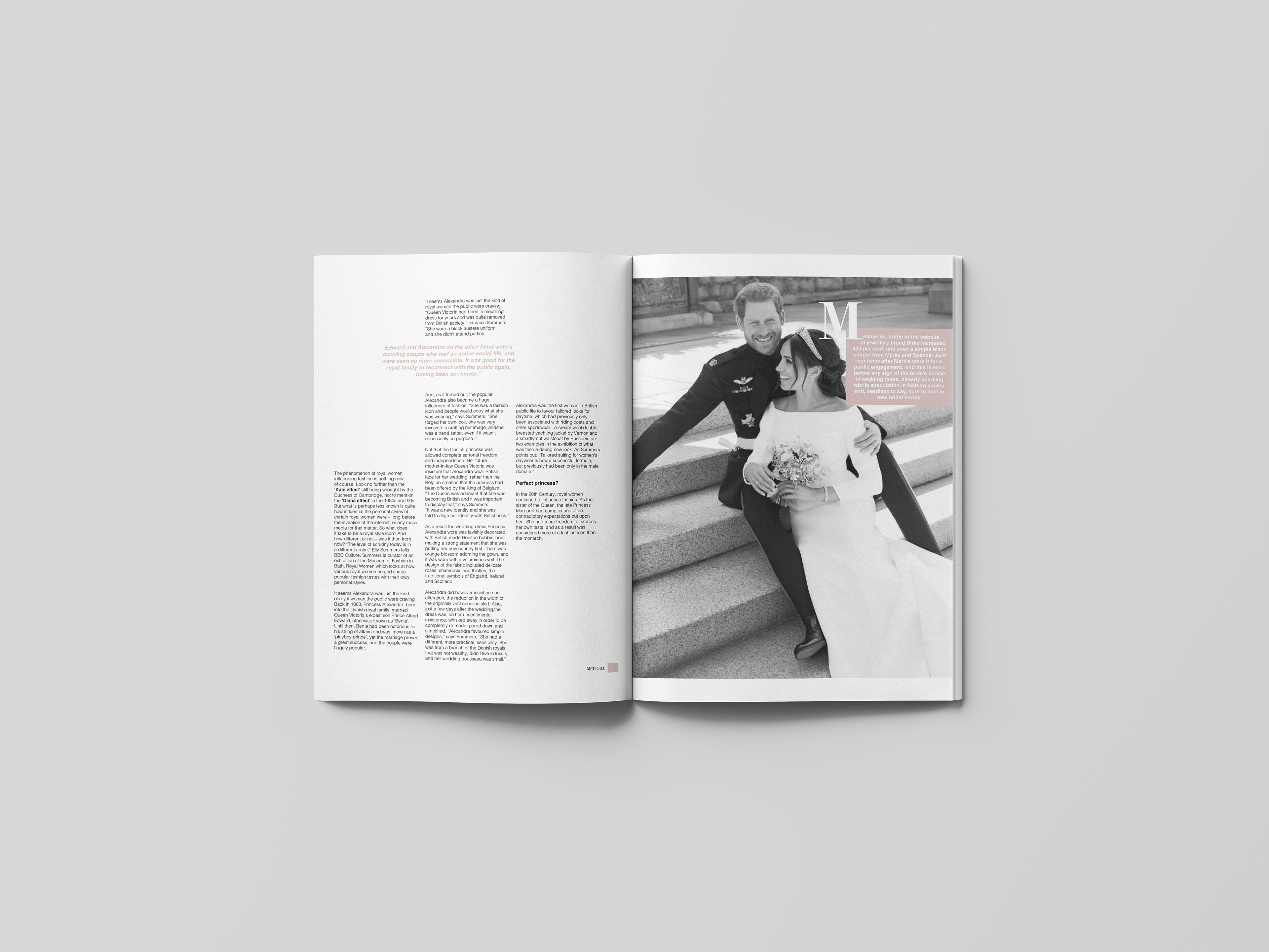
The purpose of this project was to create a new magazine publication with a unique name and theme. Using a featured article and create a monthly issue and an alternative. This included a masthead, two covers, a single page for a table of contents, and an opening spread.
The purpose of this project was to create a new magazine publication with a unique name and theme. Using a featured article and create a monthly issue and an alternative. This included a masthead, two covers, a single page for a table of contents, and an opening spread.
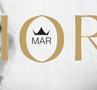
Meliora is a fashion-focused magazine that takes a unique aspect of fashion and makes a focused issue for it each month.
Meliora is a Latin word that translates to better. The purpose of this magazine is to explore your fashion sense and create a better you. Each issue is focused on creating easy to read as well as informing its readers of the current trends. Each issue will be focused on fashion as well as beauty and lifestyle information, and how it's being influenced by current trends. The target audience is young women who are between the ages of 13 to mid-twenties, who are interested in fashion and are trying to improve their style.
Meliora is a Latin word that translates to better. The purpose of this magazine is to explore your fashion sense and create a better you. Each issue is focused on creating easy to read as well as informing its readers of the current trends. Each issue will be focused on fashion as well as beauty and lifestyle information, and how it's being influenced by current trends. The target audience is young women who are between the ages of 13 to mid-twenties, who are interested in fashion and are trying to improve their style.
Process
The first step was to research similar magazines within my target audience and niche. Afterward, the next step was a series of grafting high-quality images and typographic studies to create a cohesive publication. After curating a custom font and a way to easily switch out the theme for each publication, it was time to focus on the content. The curated balance between the images was crucial to this project. My main focus was to give a publication that can be easy to flip through, but also to have a clear hierarchy of information for a more in-depth look.
Featured article by Lindsay Baker
Alternative cover for the second issue


