About the Project
Using your initial, create a typographic logo that can be easily applied to your brand.
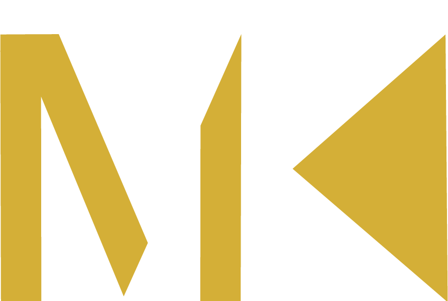
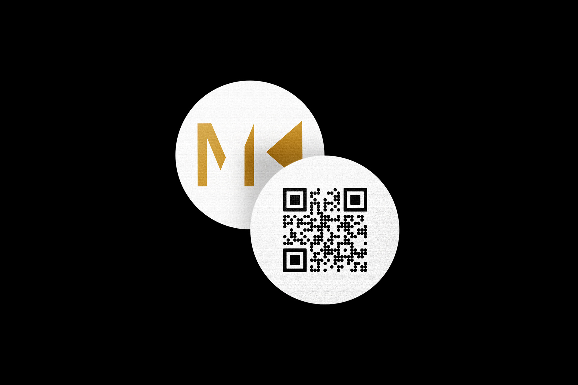
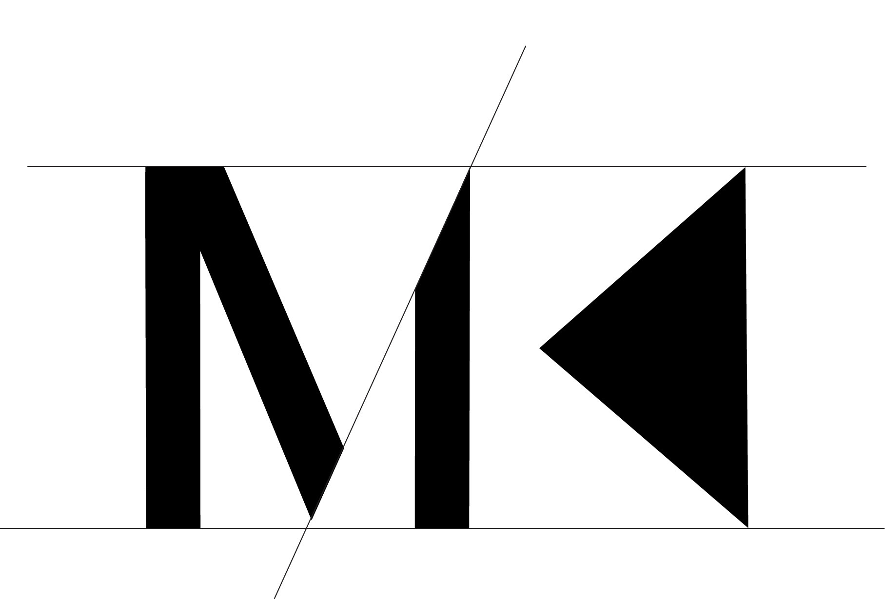
For my brand, I chose to combine my three initials, MVK, to create a modern logo I could incorporate into my social media and create watermarks for artworks. The main focus was meant to have more of a classic yet modern look that I could easily incorporate in my work and different aspects of my brand.
Process
My main focus was the have a clear feel of what type of graphic design work you can expect by just looking at the logo, as well as to have a clear difference between the Michael Kors logo and mine. Since the initials are the same, I didn't want to get confused with the brand, so I did so by adding my middle initial. Since my logo has gone through a lot of modifications, my main focus was to simplify it and have a strong vision for the two main initials. However, adding the highlighted V is something that can capture the viewer to look at the logo longer and be able to discover it themselves. As I have mostly associated myself with my first and last name, I wanted to have the main focus on them while also leading the viewer to a more hidden middle name initial.
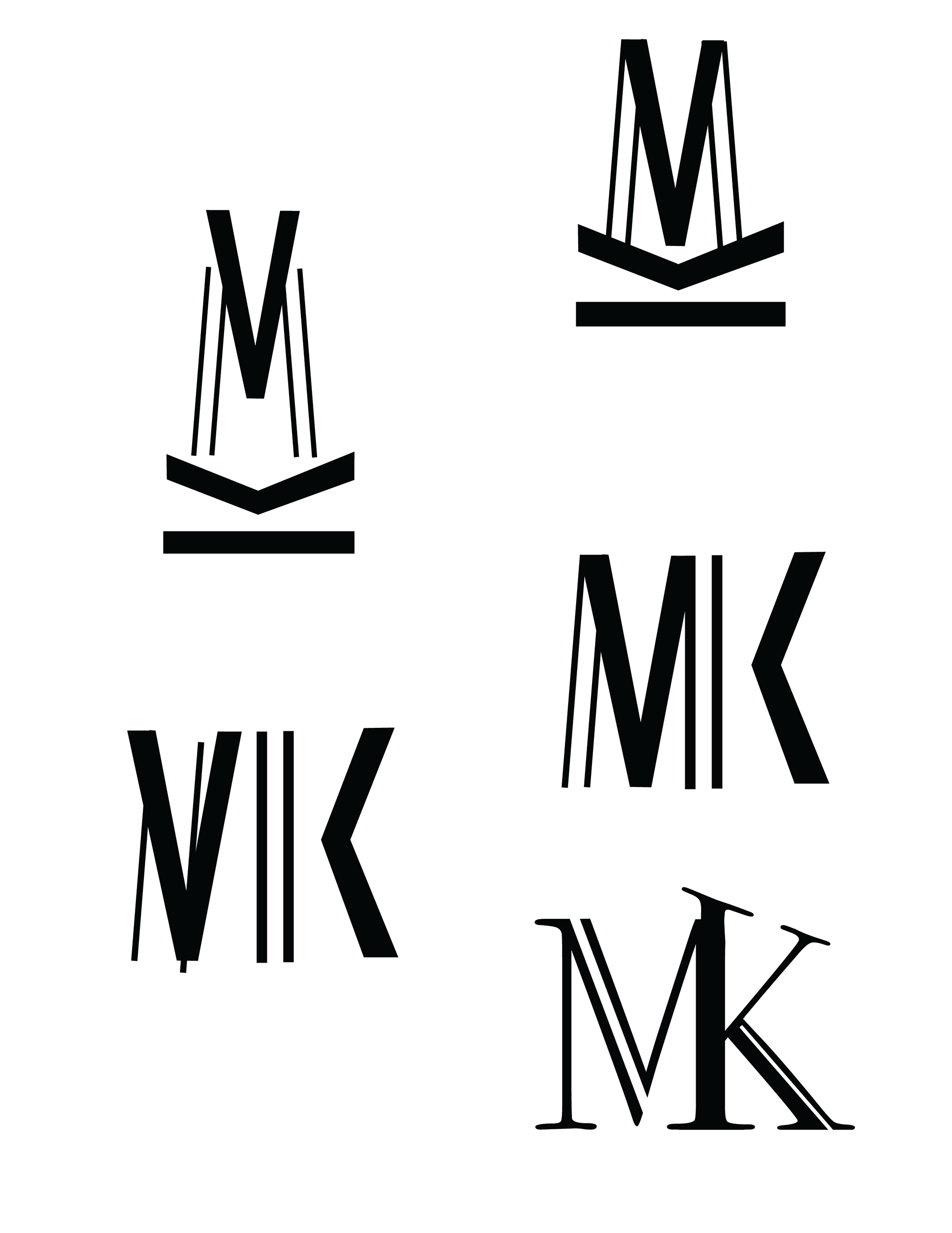
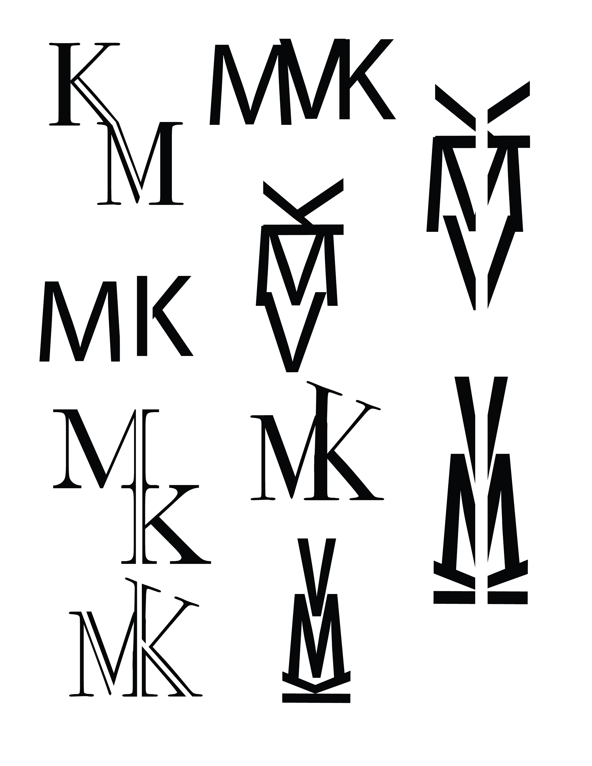
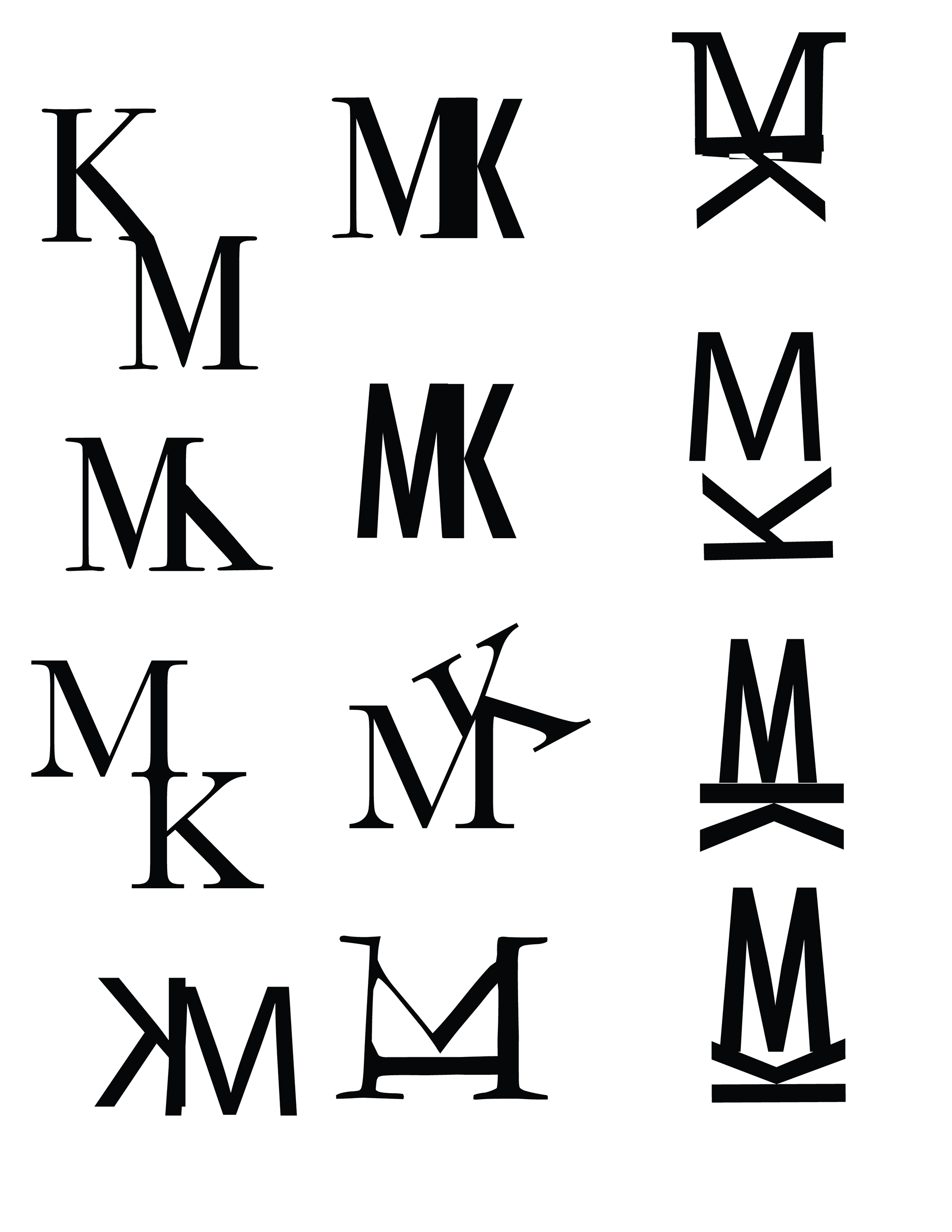
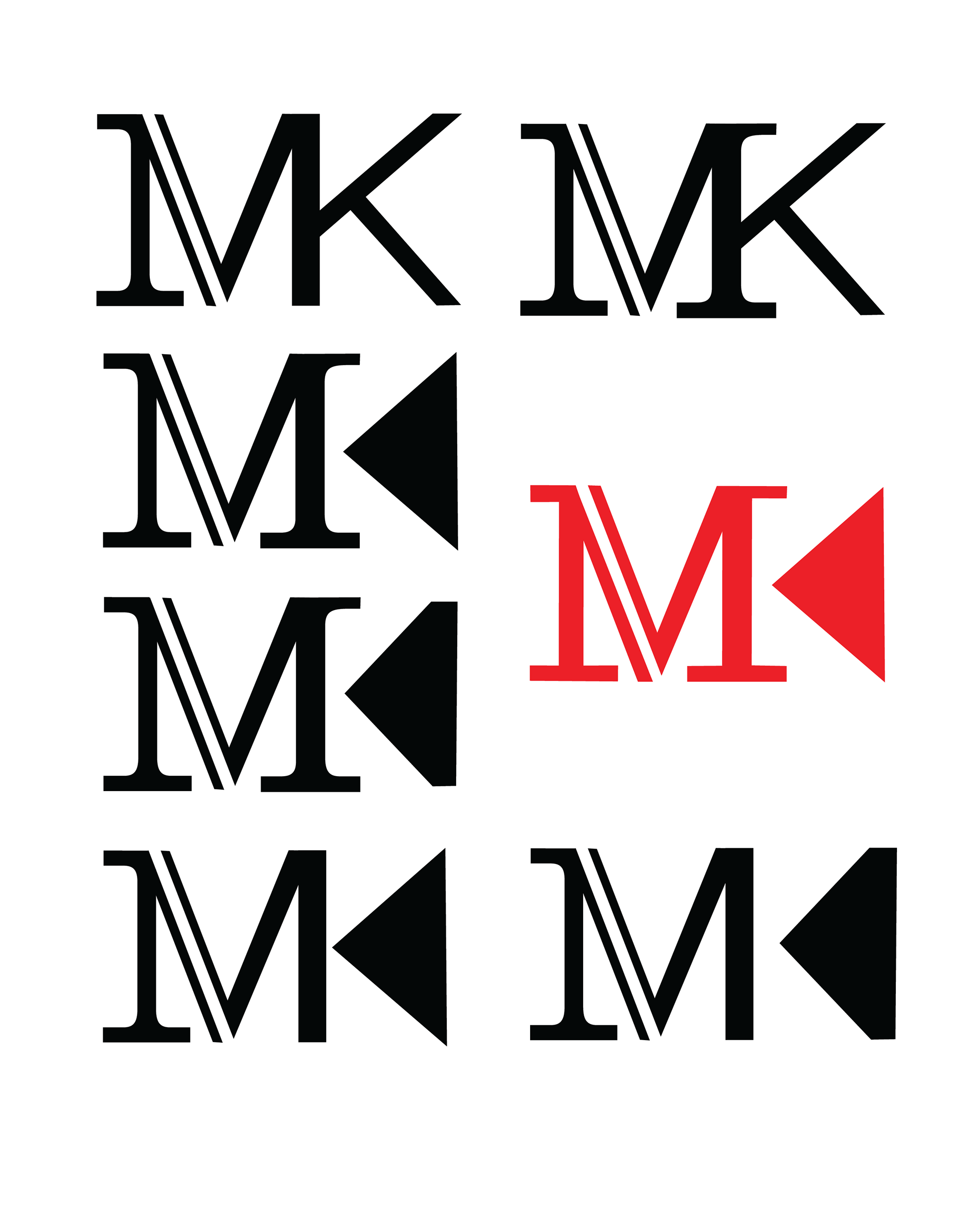
The images above are some of the explorations I've done during the exploring stage of design. The red logo was the final log I created for the project before I re-designed it to make it a bit more modern and fit with my brand.